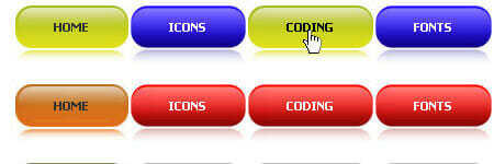
This glow effect trick with CSS is not a new trick. As the example you can see the glow effect when you mouse hover to any related post images at the end of this post. To make CSS glow effect is not hard, you just need to add 2 lines in your css class where you want your glow effect show.
Here is the 2 lines:
1 2 | -webkit-box-shadow: 0 0 5px rgba(0, 0, 255, 1);-moz-box-shadow: 0 0 5px rgba(0, 0, 255, 1); |
How to use it for an image:
1 2 3 4 | img:hover{-webkit-box-shadow: 0 0 5px rgba(0, 0, 255, 1);-moz-box-shadow: 0 0 5px rgba(0, 0, 255, 1);} |
How to use for an input box:
1 2 3 4 5 | img:hover{box-shadow: 0 0 5px rgba(0, 0, 255, 1);-webkit-box-shadow: 0 0 5px rgba(0, 0, 255, 1);-moz-box-shadow: 0 0 5px rgba(0, 0, 255, 1);} |
Since -moz-box-shadow property only work for Firefox, so this technique only work for Mozilla Firefox and friends only. This won’t work on Opera, Chrome and Internet Explorer. But most of my visitors using Mozilla Firefox so this glow effect will be seen by them. Good luck and have a nice try.

tnx man..i need dis to glow my image button.. tnx again..
this is good info.. thanks:)